Illuseum
This mobile app was designed for Illuseum Berlin, an interactive museum focused on visual illusions and immersive experiences. The goal was to create a user-friendly interface that reflects the playful and intriguing nature of the museum while streamlining the ticket purchase and navigation process.
Service Provided

Context & Challenge
Museums like Illuseum offer highly visual, sensory experiences—but translating that into a clear, accessible mobile experience posed several challenges:
How do you guide users through a wide variety of illusions without overwhelming them?
How can you maintain an intuitive interface while incorporating vibrant, attention-grabbing visuals?
How do you maintain clarity in navigation for visitors of all ages?
Design Challenges
Presenting multiple categories and exhibitions in an engaging but organized way.
Ensuring quick access to essential actions (buy tickets, search, find favorites).
Balancing playful aesthetics with usability and readability.


Key Design Solutions
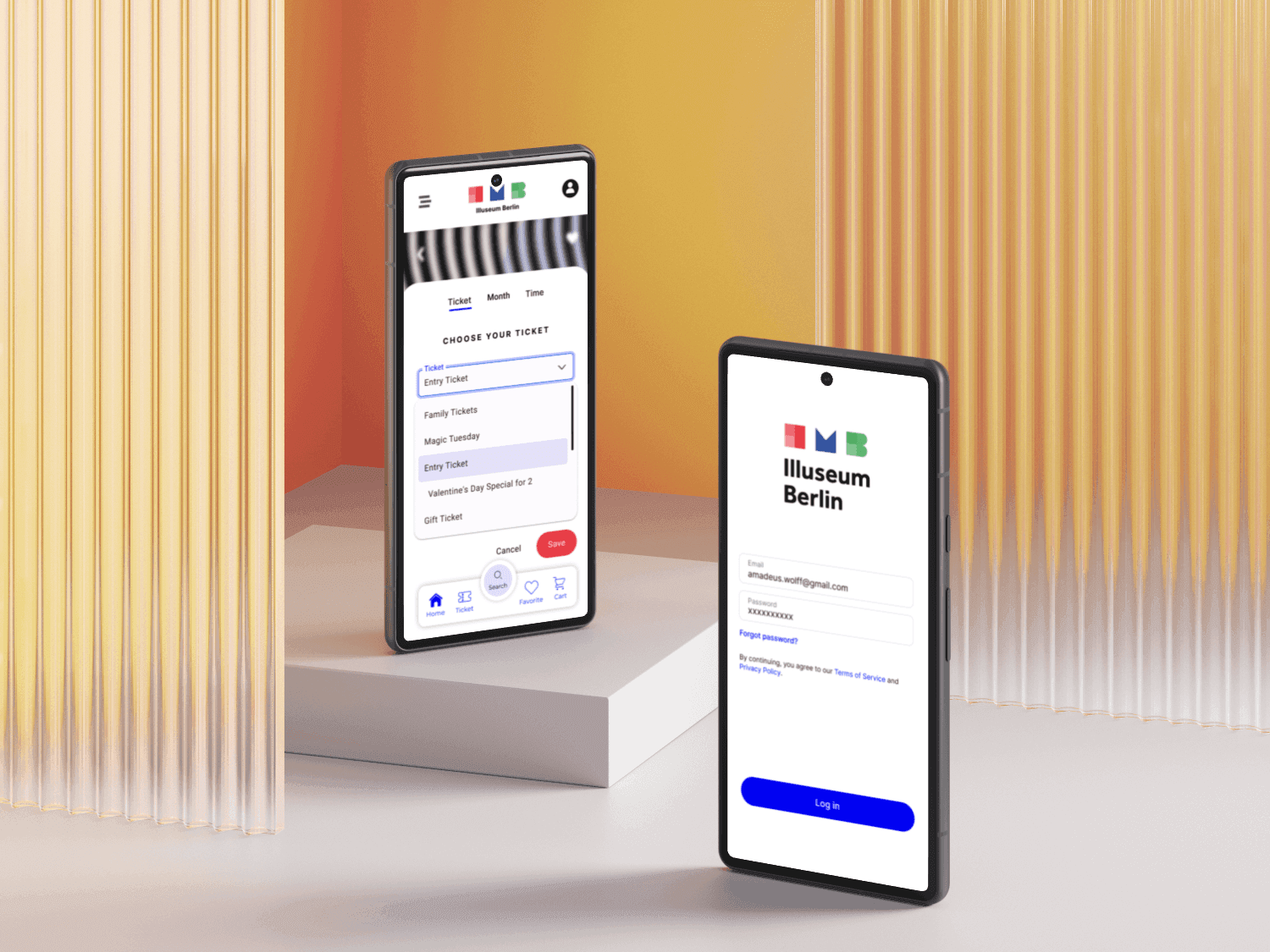
Central Search Button: Positioned prominently to help users quickly find their desired illusion or section. This reduces decision fatigue and ensures fast access to content.
Room of Illusion Section: Highlights individual exhibits with short descriptions and clear call-to-action buttons (e.g. “See Details”, “Buy Ticket”), offering context without clutter.
Favorites Button: Allows users to save preferred illusions so they can easily return and purchase tickets later.
Cart Integration: Offers a clear summary of selected tickets/products, with functionality to adjust quantity and proceed to checkout.
Colorful Visual Identity: Each screen embraces bold colors and imagery reminiscent of the museum’s immersive installations, while maintaining a coherent layout and structure.
Outcome
An intuitive, colorful app experience that mirrors the magic and curiosity of Illuseum Berlin. The app is designed to guide both new and returning users through the exhibition options, enhancing the overall museum experience before visitors even walk through the door.
What I Learned
This project emphasized the importance of combining playful visual design with strict usability standards. It reinforced the value of clear iconography, concise copy, and consistent navigation patterns—especially in public-facing apps where audiences vary in age and tech-savviness.
